ELEVATING TELEHEALTH EXPERIENCE
Vitalink Telehealth App
Project introduction
Project description & Background
The inspiration for this project comes from the excessive wait times patients face in Canada when seeking non-urgent care. The median wait to see a specialist is over 78 days, and walk-in clinics report average waits of around 93 minutes. These delays create unnecessary friction for patients whose needs could often be addressed virtually, while also straining limited in-person resources. This project explores a virtual care solution aimed at reducing wait times and freeing up clinic capacity for urgent cases.
Problem Statement & HMWs
The traditional healthcare system's in-person appointments and long wait times for physicians create significant scheduling conflicts and inconvenience for busy individuals. The proposed How-Might-We (HMW) for this is:
'How might we streamline the process of finding and booking a healthcare provider to make it as quick and efficient, considering factors like availability, language, and specialty?'
In addition to this, users lack a reliable and objective source of health insights between doctor's appointments. This gap leads them to rely on unreliable sources (like "Dr. Google") for symptom analysis, which can cause unnecessary anxiety or, conversely, lead them to ignore potentially important health signals. So the proposed HMW to address this is 'How might we leverage AI to provide users with transparent, data-driven health insights based on their tracked metrics and symptoms?'
Research 👤
After doing a brief market analysis, there are quite a few existing products that provide tele-healthcare, and their focuses include virtual appointments, video/phone/text consultations, chronic and non-urgent care, prescription refills, mental health support etc. To stand out, emphasis on symptom tracking and analysis might be the main focus for this application while keeping a few other secondary feature

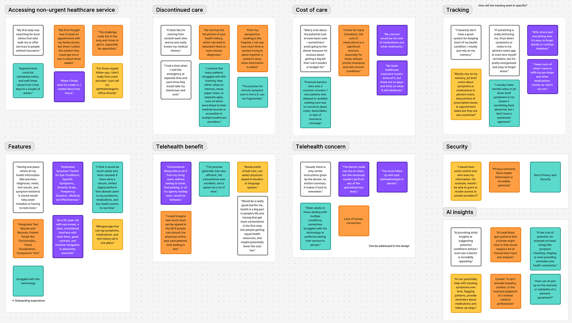
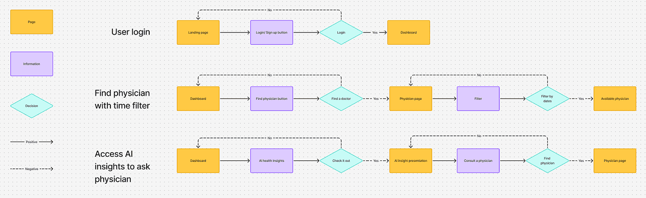
The user interviews provide some insightful ideas for this project, and the user flow is constructed with three features intended to be tested during the usability test later on.
Project Goal 📝
The goal of Vitalink is to deliver accessible, user-friendly, and remote healthcare by enabling users to connect virtually with healthcare providers for appointment scheduling while enabling personalized health awareness and proactive well-being management.
Since this is a design sprint that span about 2 weeks, the Minimal-Viable Product (MVP) is focused on features:
User secure login
Profile
AI-powered health Insights
Symptom tracking
Find & Scheduling with healthcare provider
Design & Iterations 🔄
Low-fidelity phase
The early design phase began with low-fidelity wireframes of Vitalink. These were tested with users to gather initial feedback on layout, flow, and usability.

High-fidelity phase
The wireframes were then refined into high-fidelity designs, incorporating insights from the first round of testing. This version underwent usability testing to further evaluate how well the product aligned with users’ needs.

Iteration phase
The design was iterated further based on usability testing results. Below, I highlight several key iterations along with the rationale behind each decision.


Outcome
One key indication for success of the product is the qualitative feedback from the users. With the usability testing on the hi-fidelity design, users expressed that the redesigned flows felt simpler and more reassuring. For instance, a user expressed “This feels much easier to follow.” and another commented “I’d actually feel comfortable booking through this”, this shows the indication that the design aligns with the project’s goal in building trust in tele-healthcare service.
While the sign-in and health insights were completed quickly, filters and booking still took slightly longer. This suggests the design reduced friction overall but still leaves room for refinement in the filtering process.
Social implication 🌍
The social implication here is straight-forward. By improving confidence and reducing complexity, the design can help patients access care more comfortably and consistently. In real-world application, this means fewer people might delay seeking medical help due to confusing or intimidating telehealth tools.
Even though this product still has significant room for improvement, the features it provides already demonstrate clear benefits for multiple stakeholders. Patients can access healthcare services with greater confidence and ease, while physicians are supported in delivering care more efficiently through streamlined booking.
Beyond the immediate impact, I see this project as a step toward raising awareness of the importance of user-friendly telehealth tools. By showing how thoughtful design can reduce barriers to care, I hope this project contributes to inspiring more telehealth products in the market—ultimately benefiting patients, providers, and the healthcare system as a whole.
Reflection 🤔
Throughout this project, I was surprised by how much confidence users expressed in booking through the prototype, even though it was still at a testing stage. This highlighted the importance of clear flows and trust signals in healthcare design.
I also discovered that while symptom tracking was appreciated, the interface could feel crowded at times. This reinforced the need for careful balance between comprehensiveness and simplicity in presenting health data.
To continue this project in the future, I would explore leveraging AI to provide physician recommendations based on user's personal preferences (e.g., preferred communication style, experience, or specialization). This could make the app more proactive in supporting patient decision-making and better align with the product's goal.
Looking ahead, there are several things I would do in the future. One is to leverage AI for physician recommendations—helping users match with doctors based not only on availability and specialization, but also on personal preferences such as language, gender, or communication style. Another is to design the physician-facing interface to complete the experience: enabling physicians to update their profiles, manage availability, and securely access their patients’ logged health insights. This dual-sided design would make the system more holistic and mutually beneficial for both patients and providers.


