UX ITERATION
Simplifying Budgeting inside KOHO: making savings more visible and motivating

What is KOHO?
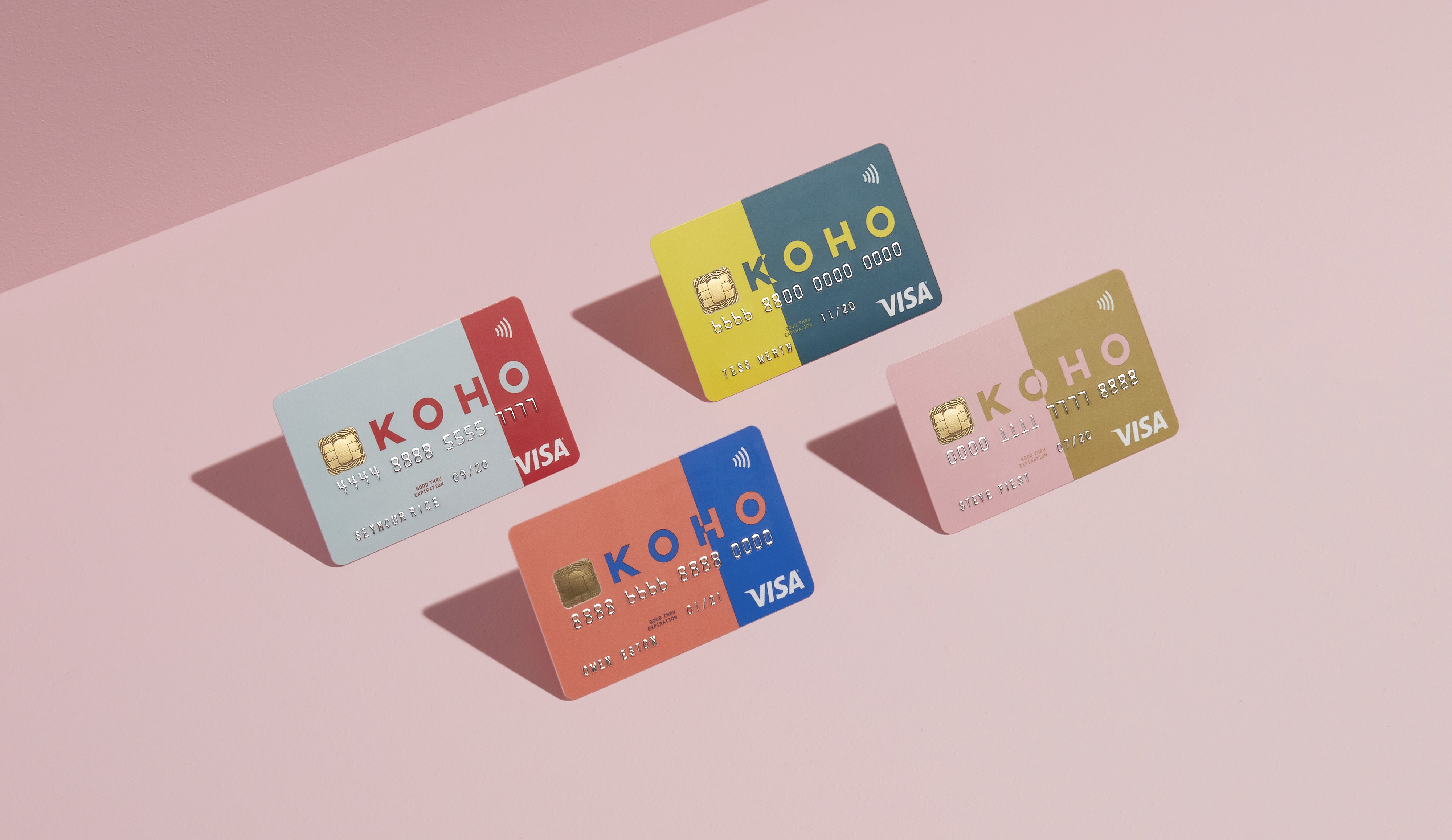
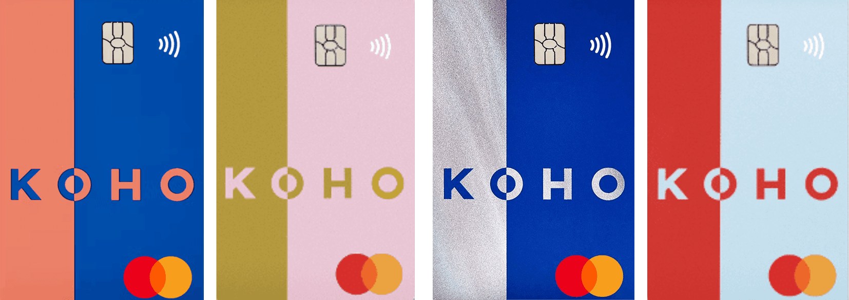
KOHO is a mobile-first Canadian fintech platform that offers spending, savings and budgeting tools via a prepaid card and app.
Why this budgeting feature was necessary
Many users (especially younger Canadians) are managing irregular income and rising costs. For example, KOHO found average monthly income for Gen Z users was around ~$1,083 and fluctuated ~18%.
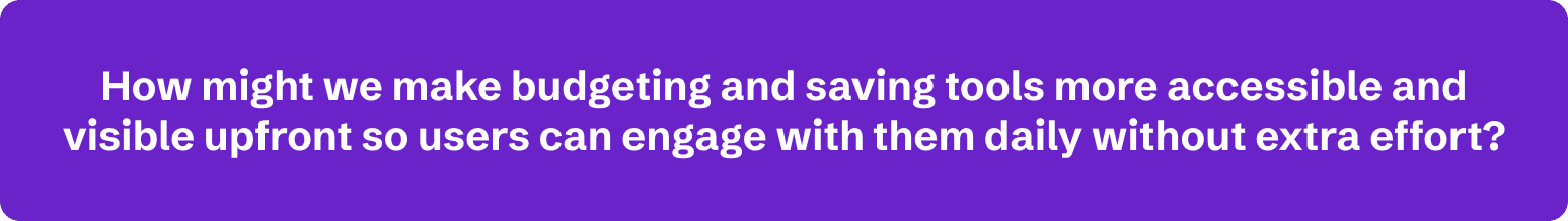
Existing budgeting tools in KOHO were not sufficiently visible or motivating; users reported too many layers to access “Vault” and saving goals 💰.
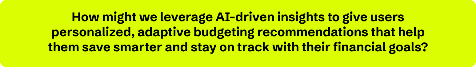
Insights from market research by comparing KOHO and two finance technology platforms also shows the lack of easy budgeting tool available to users. As well as the lack of AI adoption in their user experience. Where these two aspects can highly resonate to each of their own mission statement and bring it closer to their product's goals. Thus, this create opportunity for my vision for this project.
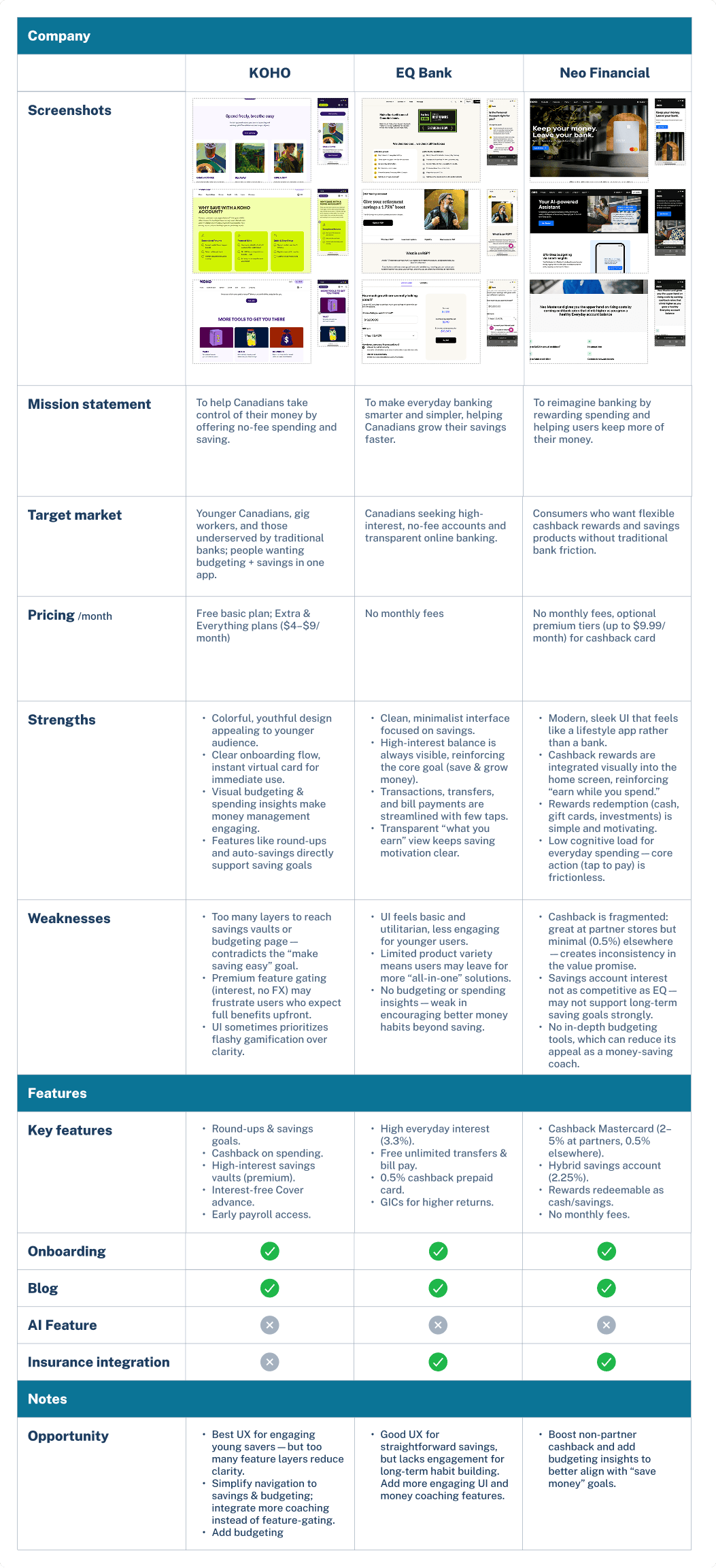
Pain Points
Part of the users' struggle is to find KOHO’s saving goals and vaults too hidden under multiple layers, which discourages them from checking progress and staying consistent 😣.
Users often lack clear guidance on how much they should save or budget based on their actual spending habits. This uncertainty leads to inconsistent saving, overspending, or feeling like budgeting is unrealistic and unachievable.
The HMWs
What success would look like
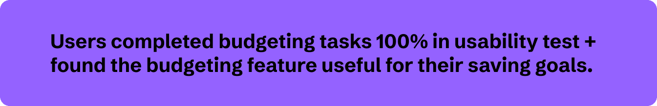
90% or more task completion in prototype test by our users.
Users rate ease of use of the feature ≥ 4/5.
More than 50% of users transfer Budget surplus into their Vaults or Saving Goals, these two are the existing features of KOHO.
User interview

Key insights from user interviews that shaped my design direction:
- Users want visual motivation (progress bars, animations) rather than just numbers.
- Users with irregular income need flexible budget guidance (not rigid monthly budgets).
- Direct link from “budgeting action” → “saving goal” strengthens motivation and sense of progress.
Personas or insights that shaped direction
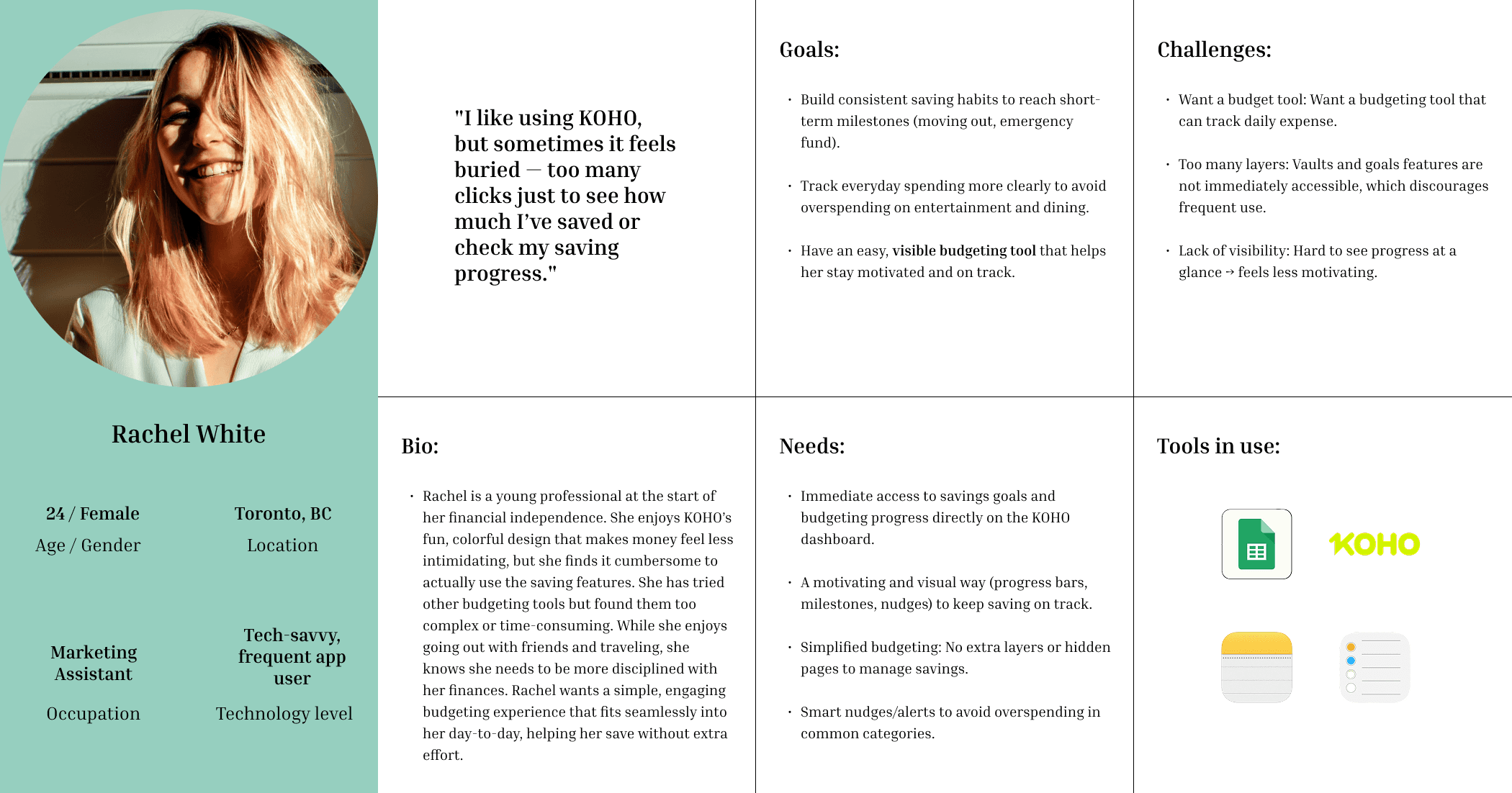
A functional persona here addresses my user's goals, the challenges that she faces, and her needs for savings. These areas set as the foundation to guide my design direction, and that I can always come back to for reference.
Ideation
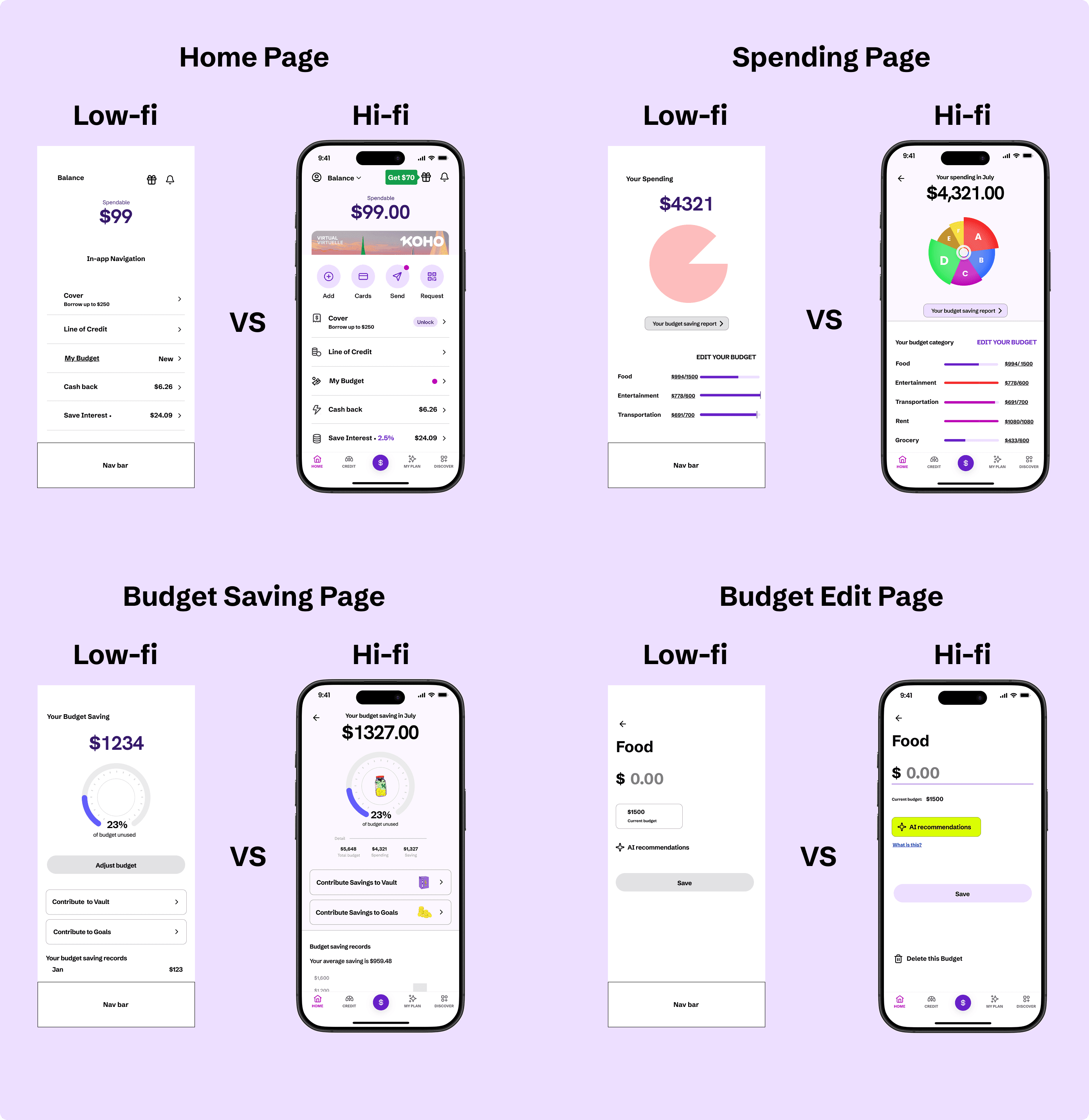
The above illustrates the high-fidelity designs alongside their corresponding low-fidelity drafts.
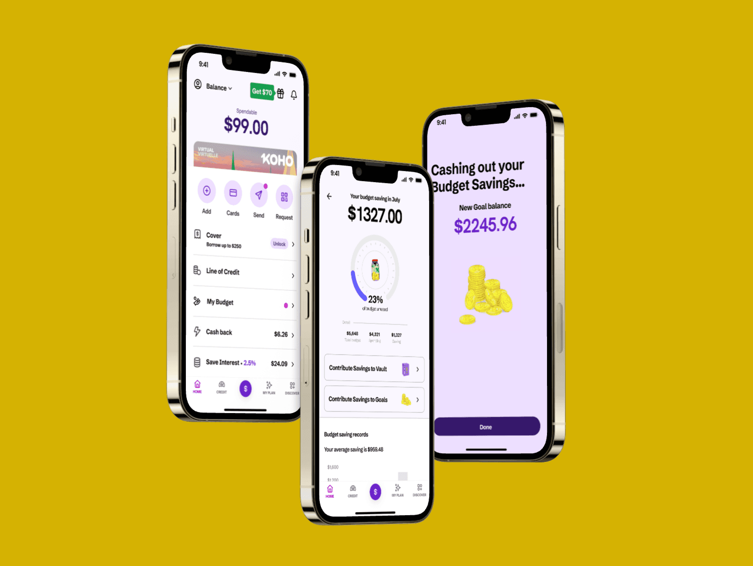
On the Home Page, the new Budget feature is seamlessly integrated into KOHO’s existing interface and marked with a red notification dot — consistent with KOHO’s established visual language for introducing new tools.
For the Budget Edit Page, the interaction model intentionally mirrors the existing design for one adjusting monetary input and output. This design decision ensures consistency within KOHO’s ecosystem, maintaining a familiar, intuitive experience for current users while reinforcing the app’s clean and approachable brand style.
Usability Testing & Iterations
What I tested: 5 moderated testing sessions using high-fidelity prototype. Users were asked to conduct the following tasks: Adjust category budge, Apply AI recommendation, Transfer budget saving surplus to Goal/Vault.
What I found: Despite task completion rate is 100% by users, iterations are made on these flow based on users’ feedback.
Iterating Design Decision:
Added tooltip “Why this suggestion?” for AI card.
Full flow for adding a Budget category.
Card shuffle on Edit budget page.
These iterations are shown below in their intended interactions —
Check out the Figma Prototype here
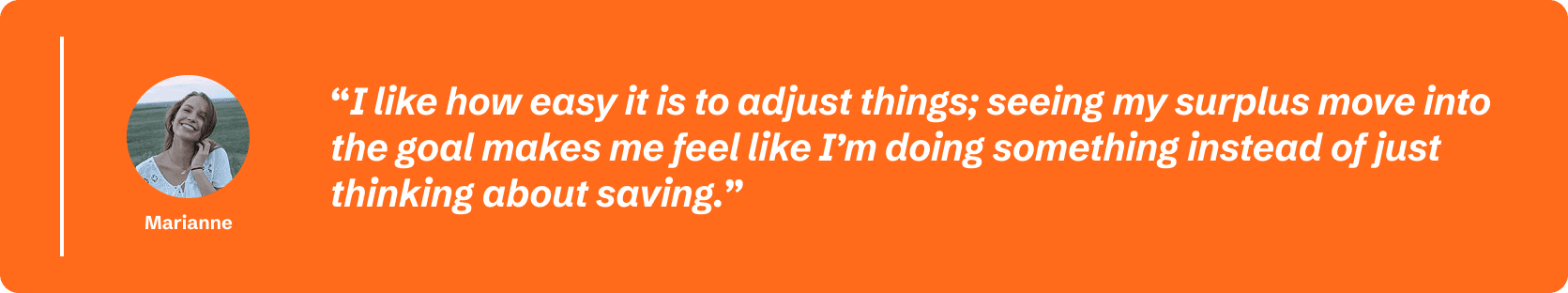
Testimonial from user
Potential business value of this project 📶
Interesting statistic: KOHO serves over 1 million users in Canada.
Increased engagement with KOHO’s budgeting tools → stronger use of savings Vaults (which earn interest).
Potential for reduced drop-off in budgeting flows; increased savings transfers strengthen deposit base.
Differentiates KOHO in the Canadian fintech space from its competitors by offering smart budgeting + savings synergy.
Personal Reflection & Next Steps
What I learned:
Designing within an existing product ecosystem requires not just solving user pain points, but also resonating with the brand’s identity and audience.
I focused on aligning visuals, motion, and tone with KOHO’s youthful, energetic brand, using color, animation, and playful micro-interactions to appeal to young, budget-conscious users 👩🏻🧑🏼.
Elevating the brand through consistency — adopting KOHO’s signature palette 🎨, typography, and rounded visual language — helped the new budgeting feature feel cohesive and trustworthy.
Strategically, this feature also encouraged deeper engagement with KOHO’s existing “Vault” saving tool, connecting budgeting actions directly to tangible savings progress.
From a design learning standpoint, visual feedback and flow simplicity proved key to usability 🗝️and motivation, while AI transparency emerged as crucial for user trust.
What I’d improve given more time:
Introduce shared budgeting for joint accounts (couples or roommates 👫).
Extend AI 💡to adapt to irregular income users (freelancers, students).